graphy Anxiety AltProcess Photo book Digital Design Fast Food Digital Design Self Expression Lighting B&W Contrast Lighting
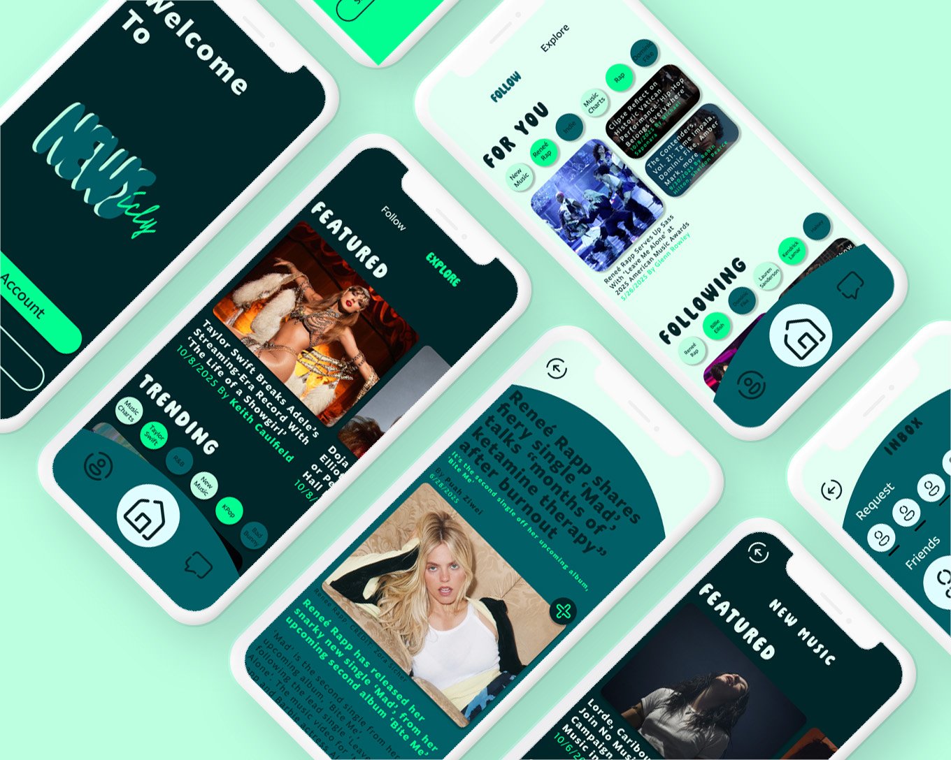
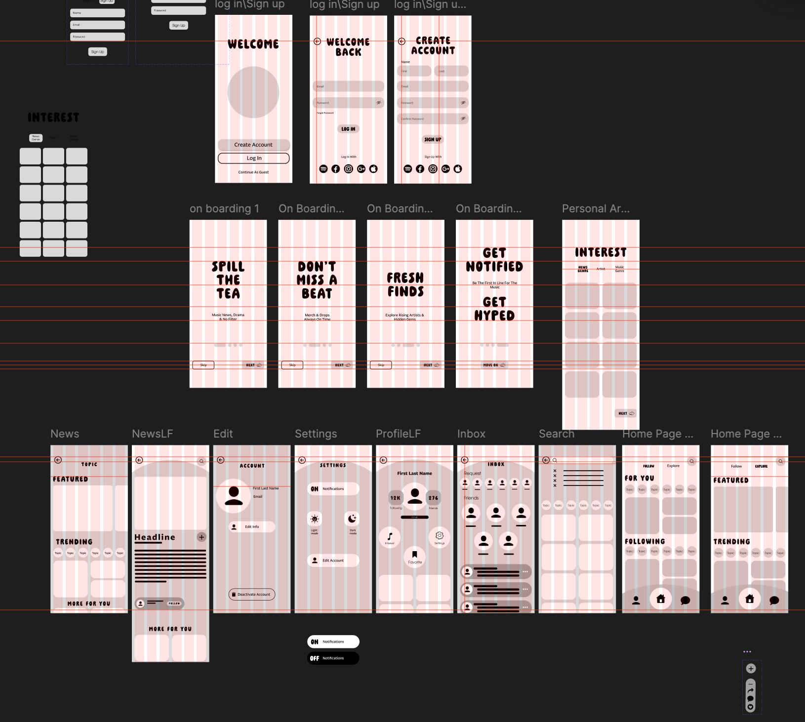
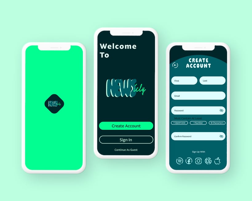
News App
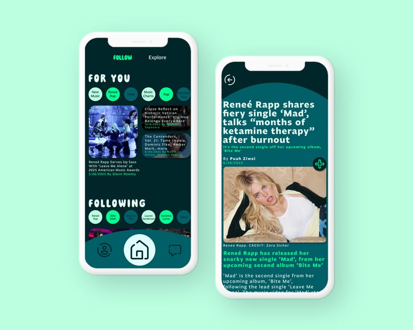
News App
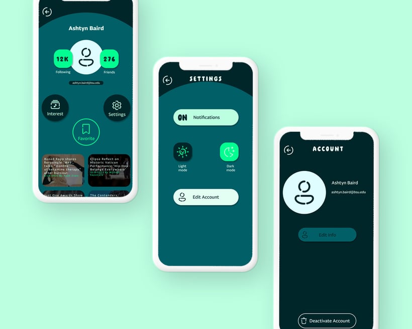
UI UX
Typography
Design Concept
Design Process
I created these logos using the typefaces Pain de Mie and Neonoir Bold because they complement each other well. One typeface gives off a bold and playful feeling, while the other has a sharper style that still keeps the fun and energetic vibe of the brand.
During my design process, I wanted to create a fun and friendly app with a bold color scheme that would stand out and grab people’s attention
Throughout the app, I also used the typefaces Pain de Mie Regular and Fagun. Pain de Mie Regular helped keep the playful personality of the brand consistent, while Fagun was used as a cleaner and easier to read typeface for more simple information and readability.
During my design process, I had to figure out how I wanted my wireframes to look. I wanted them to have a unique style while still feeling functional and easy to navigate.
UI UX
I designed both dark and light screens to work together as a cohesive whole while still keeping the same style and user experience throughout the app.
 Back To The Top


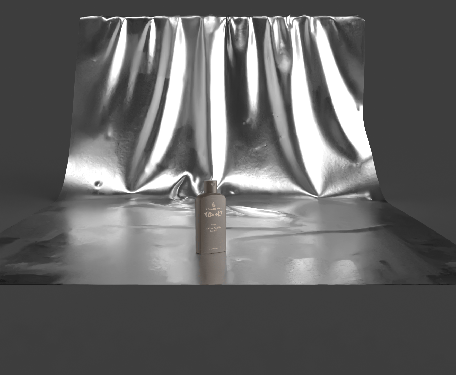
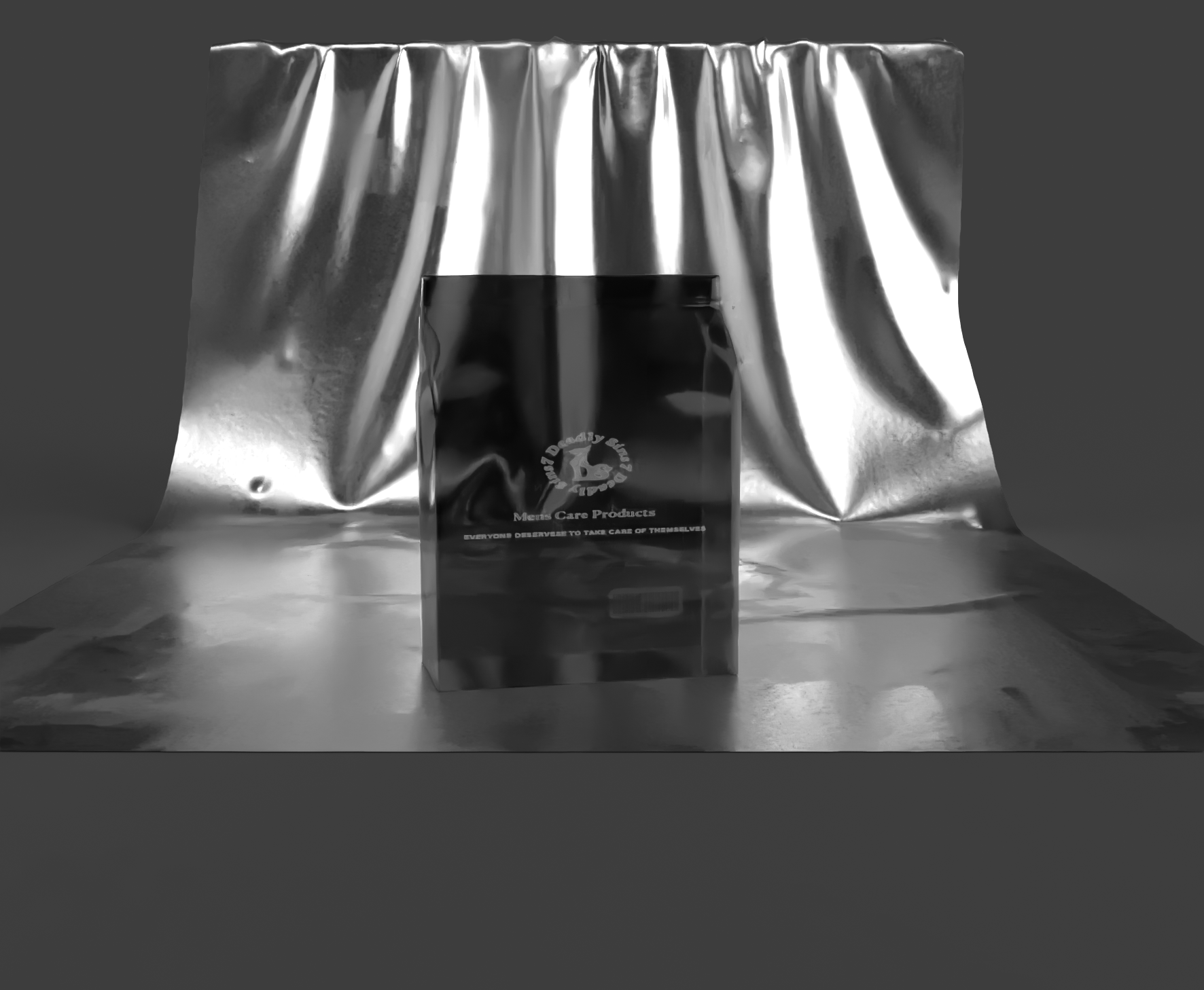
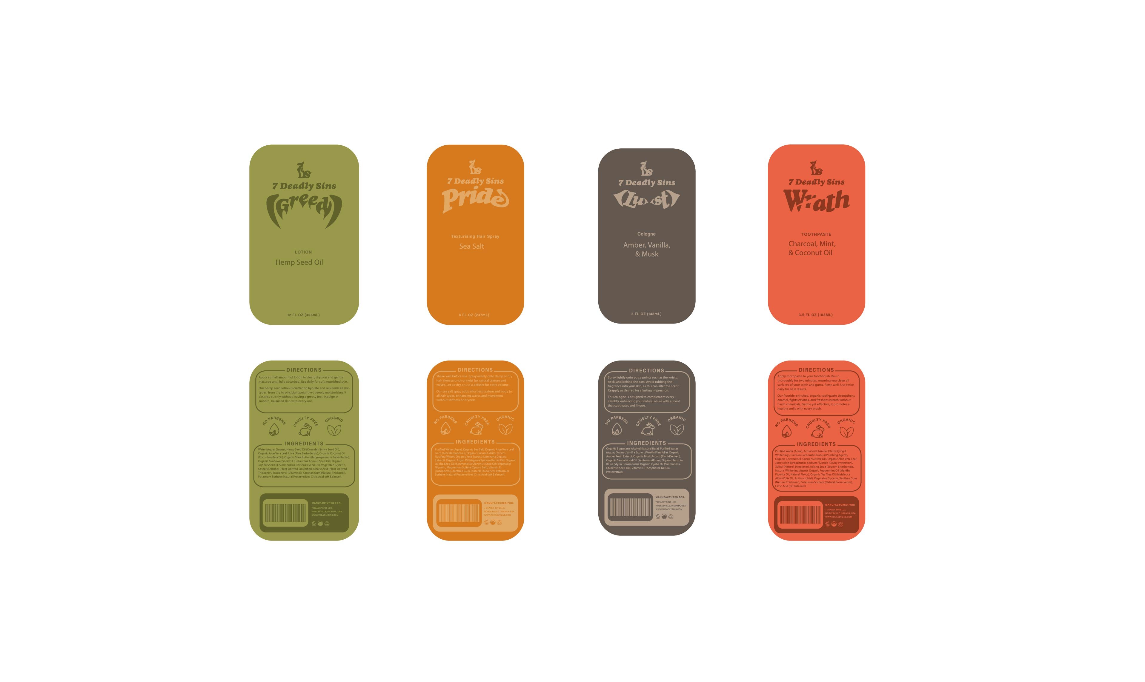
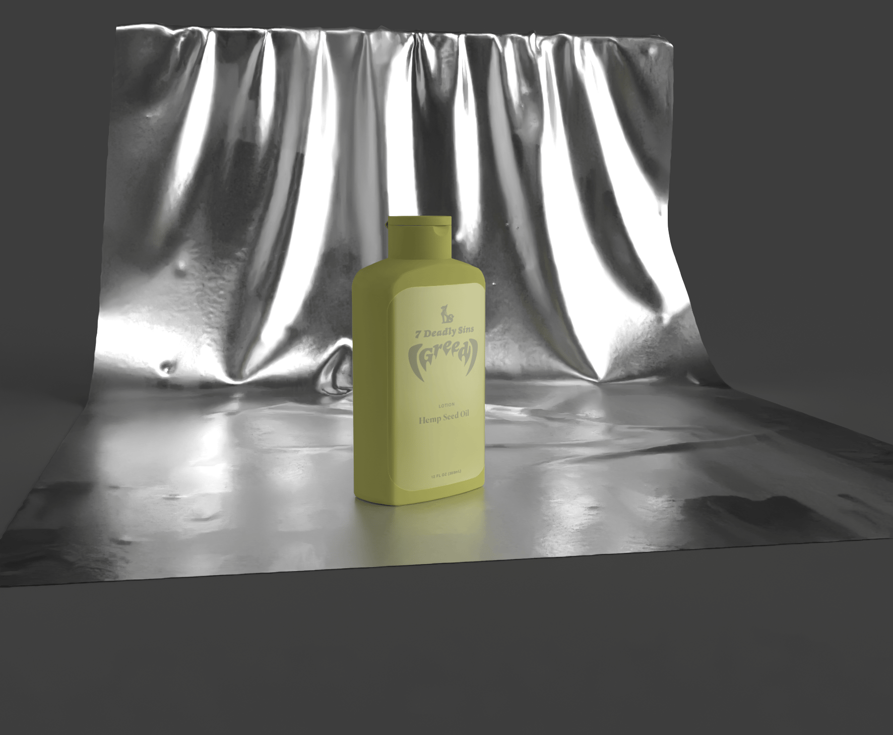
 7 Deadly Sins
SDC
I created these logos using the typefaces Salbabida Sans Pro 0620 and Sneakers Pro Regular because they are both bold sans serif fonts that complement each other well.
7 Deadly Sins
7 Deadly Sins
SDC
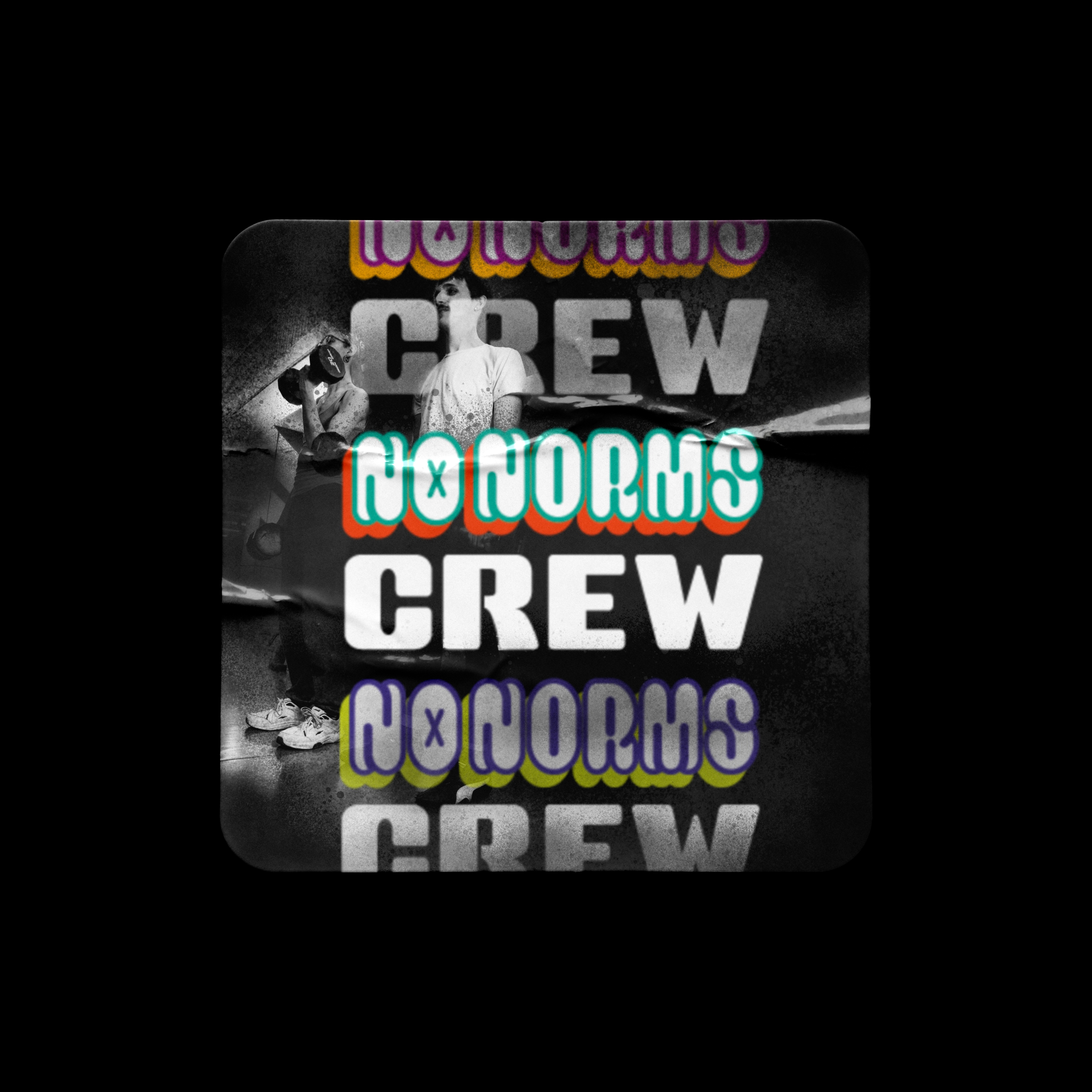
I created these logos using the typefaces Salbabida Sans Pro 0620 and Sneakers Pro Regular because they are both bold sans serif fonts that complement each other well.
I also used Salbabida Sans Pro 0620 throughout my designs in my posters and instagram post. During my design process, I reflected on my Kill Crew
project. After learning that they support LGBTQ+ convention camps, I felt inspired to push my ideas further by developing my
own clothing brand one that advocates for inclusivity
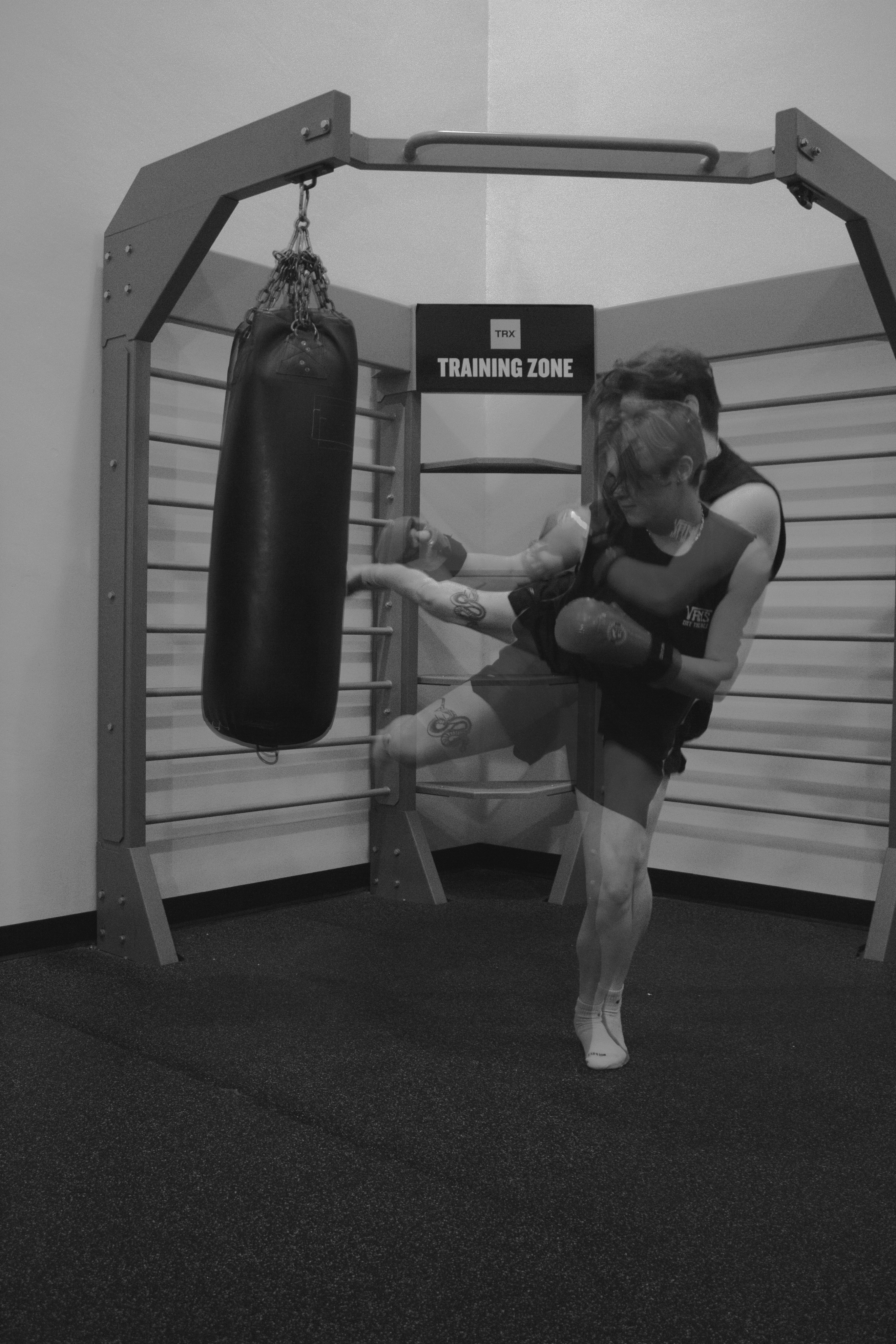
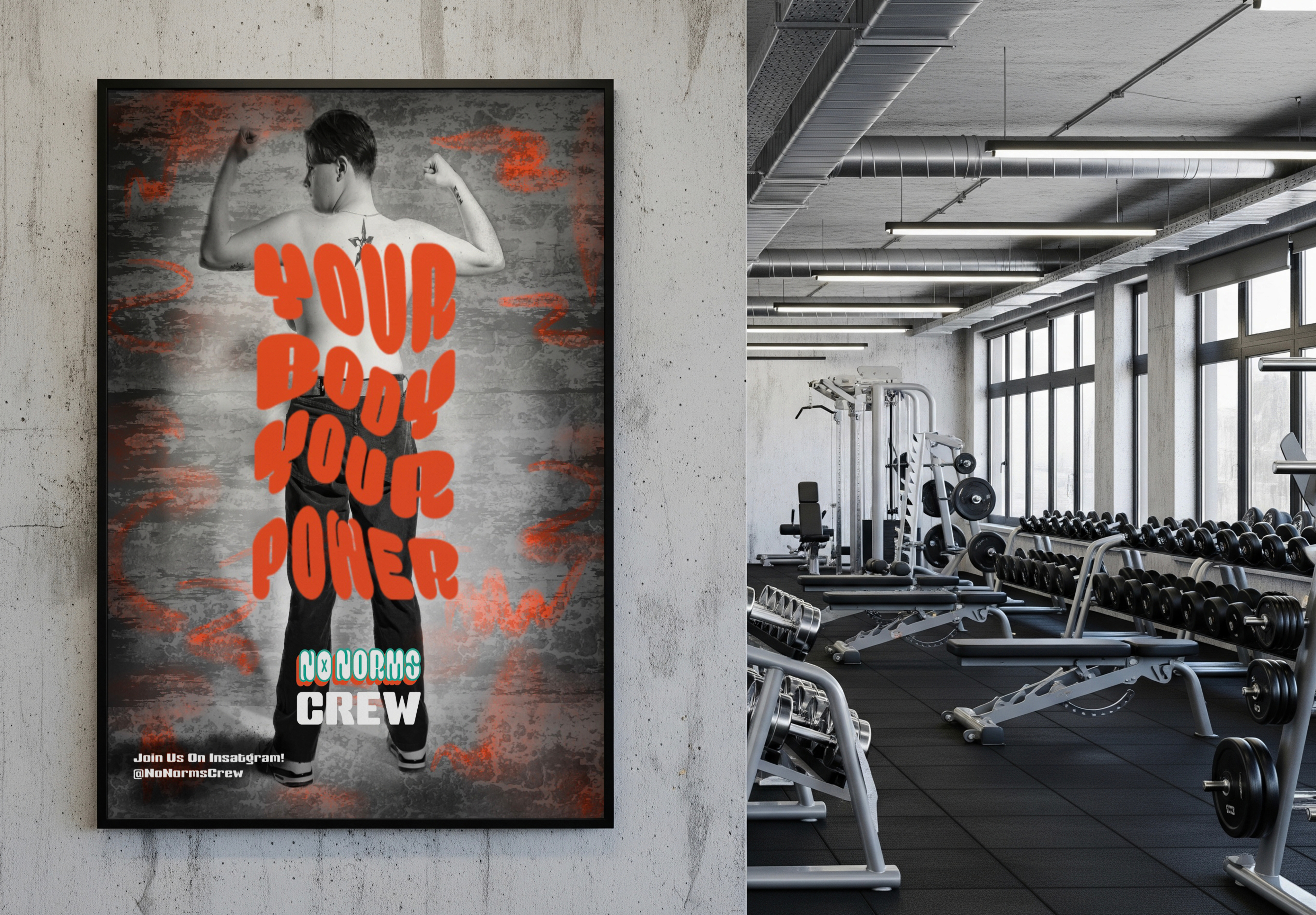
and self-expression. I designed three color variations
of the logo to keep it flexible across different uses. I also created secondary versions with a graffiti spray gradient for a more expressive, urban feel, along with black & white options for a clean, minimal look. The overall color direction was inspired by brands that embrace simplicity through limited palettes, similar to colorless pride apparel and monochromatic streetwear. Students within the LGBTQ+ community at Ball State often can experience anxiety when attempting to begin their fitness journeys. Fitness spaces can feel intimidating due to perceived judgment, rigid gender norms, and a lack of visible inclusion. Through this design project, I aim to create work that reassures LGBTQ+ individuals that they belong in fitness spaces and do not need to feel afraid of the gym. Problem Statement Instagram Posts Posters Clothing Brand I created these logos using the typefaces Salbabida Sans Pro 0620 and Sneakers Pro Regular because they are both bold sans serif fonts that complement each other well.
I also used Salbabida Sans Pro 0620 throughout my designs in my posters and instagram post. During my design process, I reflected on my Kill Crew
project. After learning that they support LGBTQ+ convention camps, I felt inspired to push my ideas further by developing my
own clothing brand one that advocates for inclusivity
and self-expression. I designed three color variations
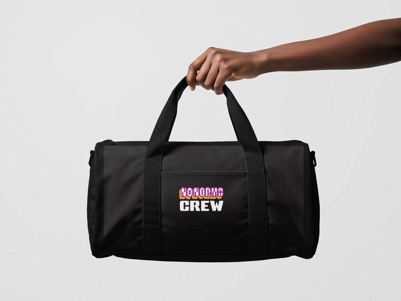
of the logo to keep it flexible across different uses. I also created secondary versions with a graffiti spray gradient for a more expressive, urban feel, along with black & white options for a clean, minimal look. The overall color direction was inspired by brands that embrace simplicity through limited palettes, similar to colorless pride apparel and monochromatic streetwear. Students within the LGBTQ+ community at Ball State often can experience anxiety when attempting to begin their fitness journeys. Fitness spaces can feel intimidating due to perceived judgment, rigid gender norms, and a lack of visible inclusion. Through this design project, I aim to create work that reassures LGBTQ+ individuals that they belong in fitness spaces and do not need to feel afraid of the gym. Extra Merchandise
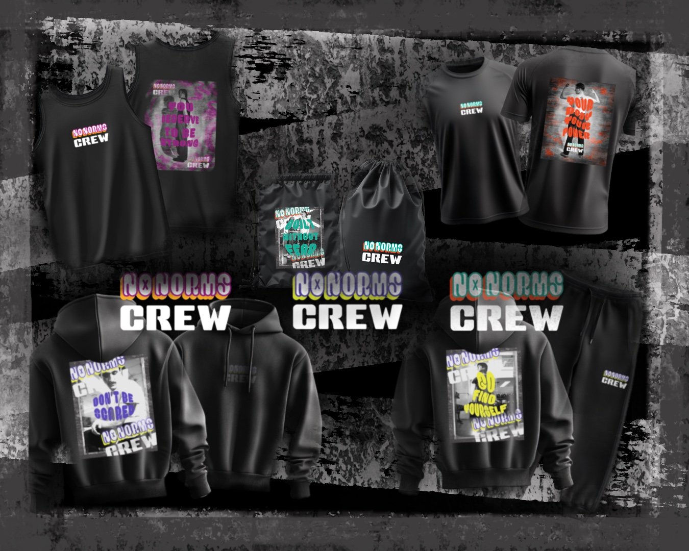
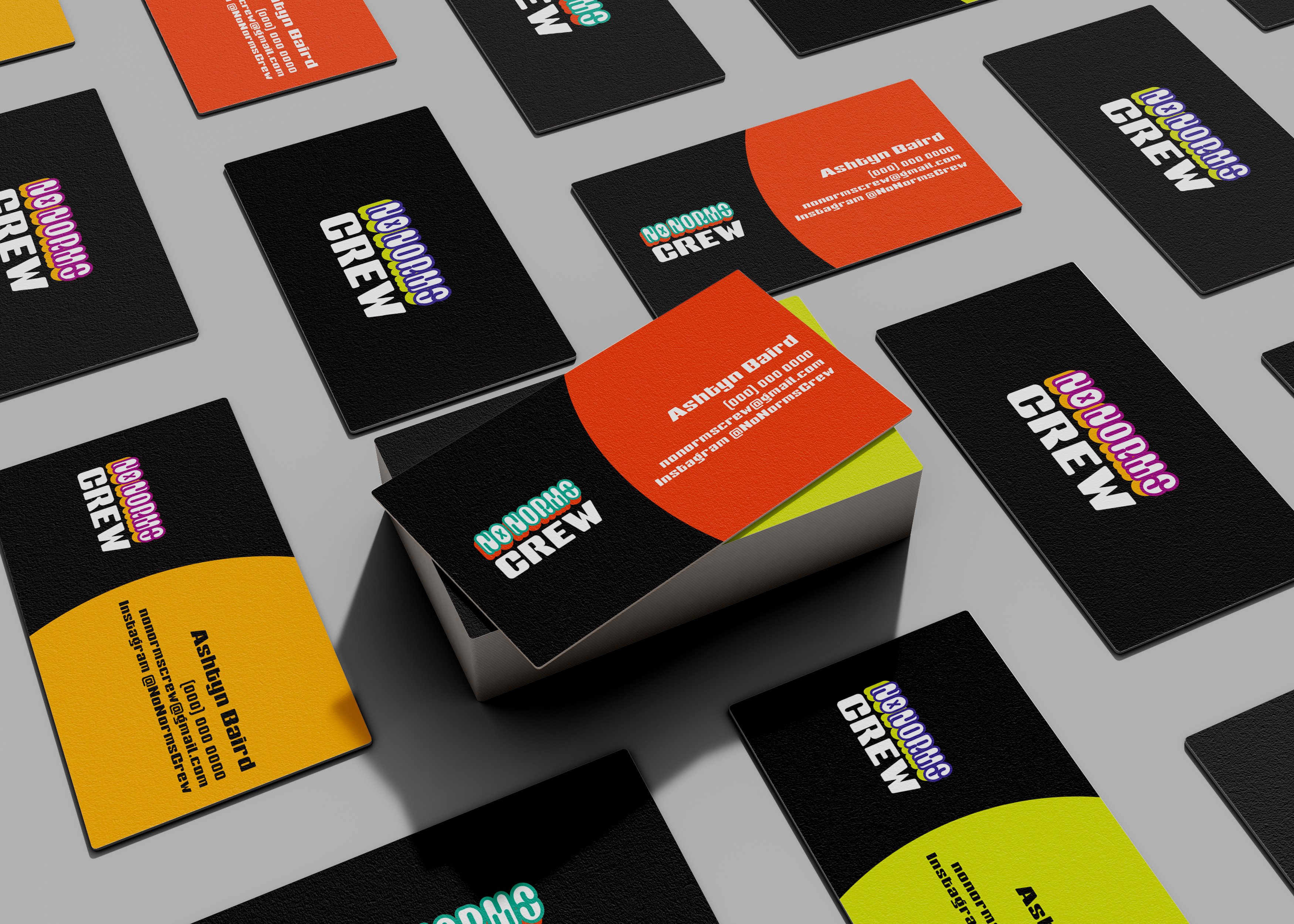
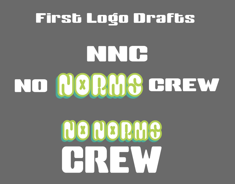
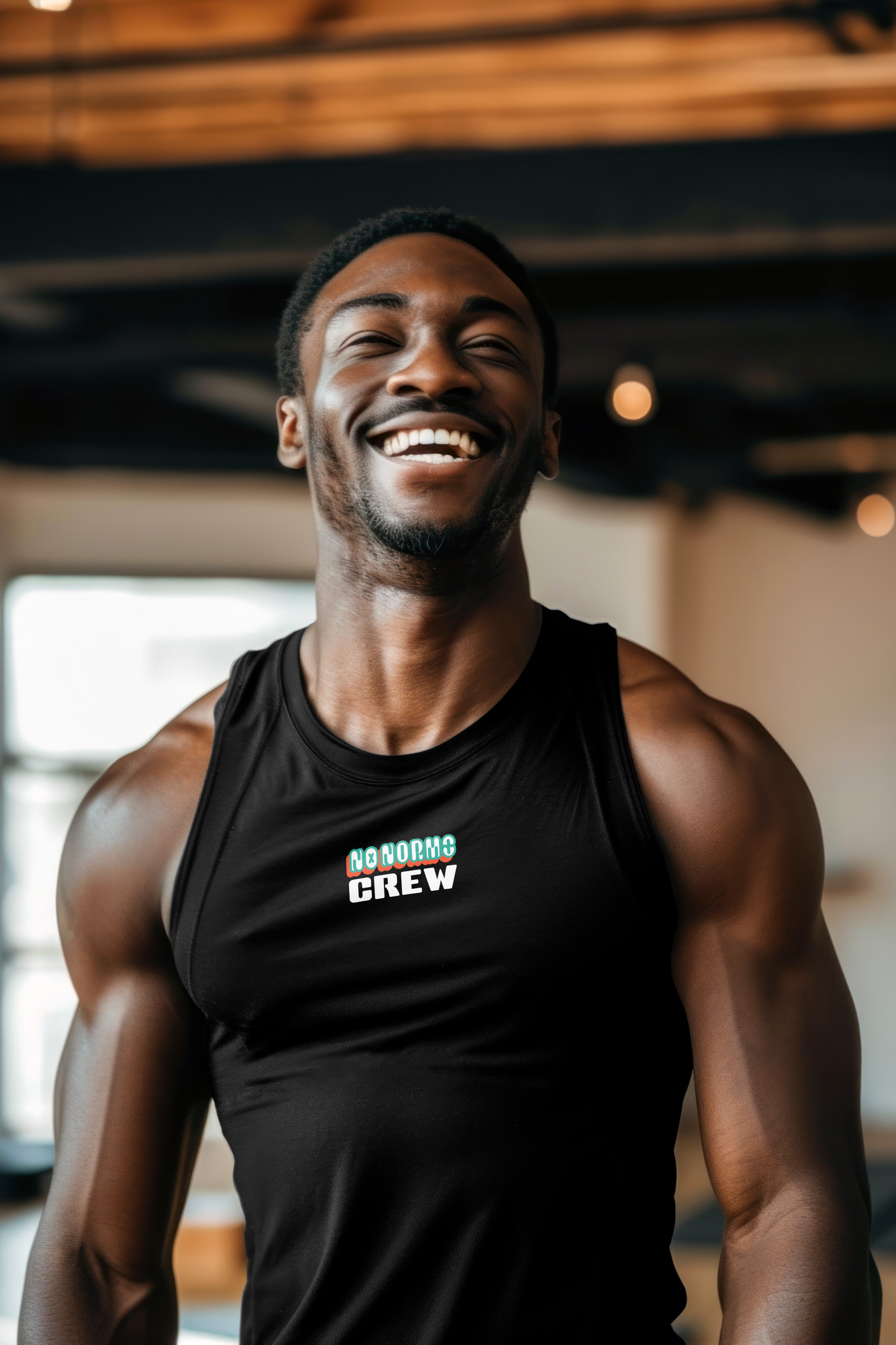

 No Norms Crew
No Norms Crew
No Norms Crew
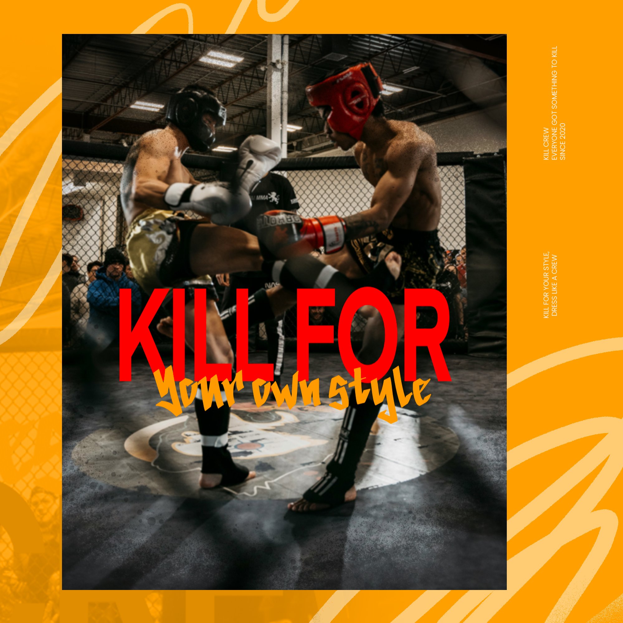
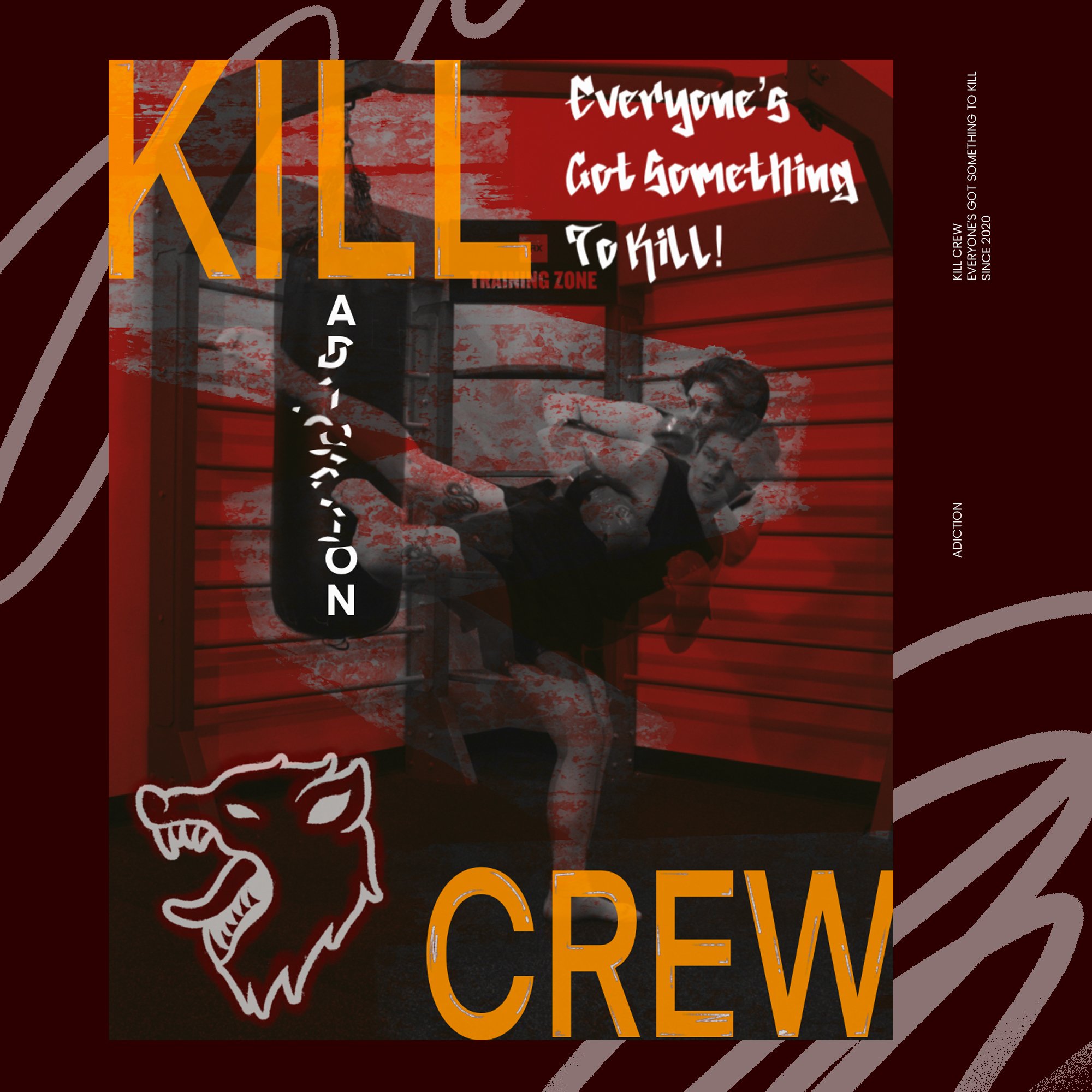
 Kill Crew
Genius Hour
For my designs, I used a mix of typography, including Helvetica Neue Medium and Easter Graffiti Demo, created in Procreate. I wanted to experiment with programs beyond Adobe to expand my design approach.
At the time of making this project i wanted to make there branding look more inclusive but i had no idea that there brand was homophobic.
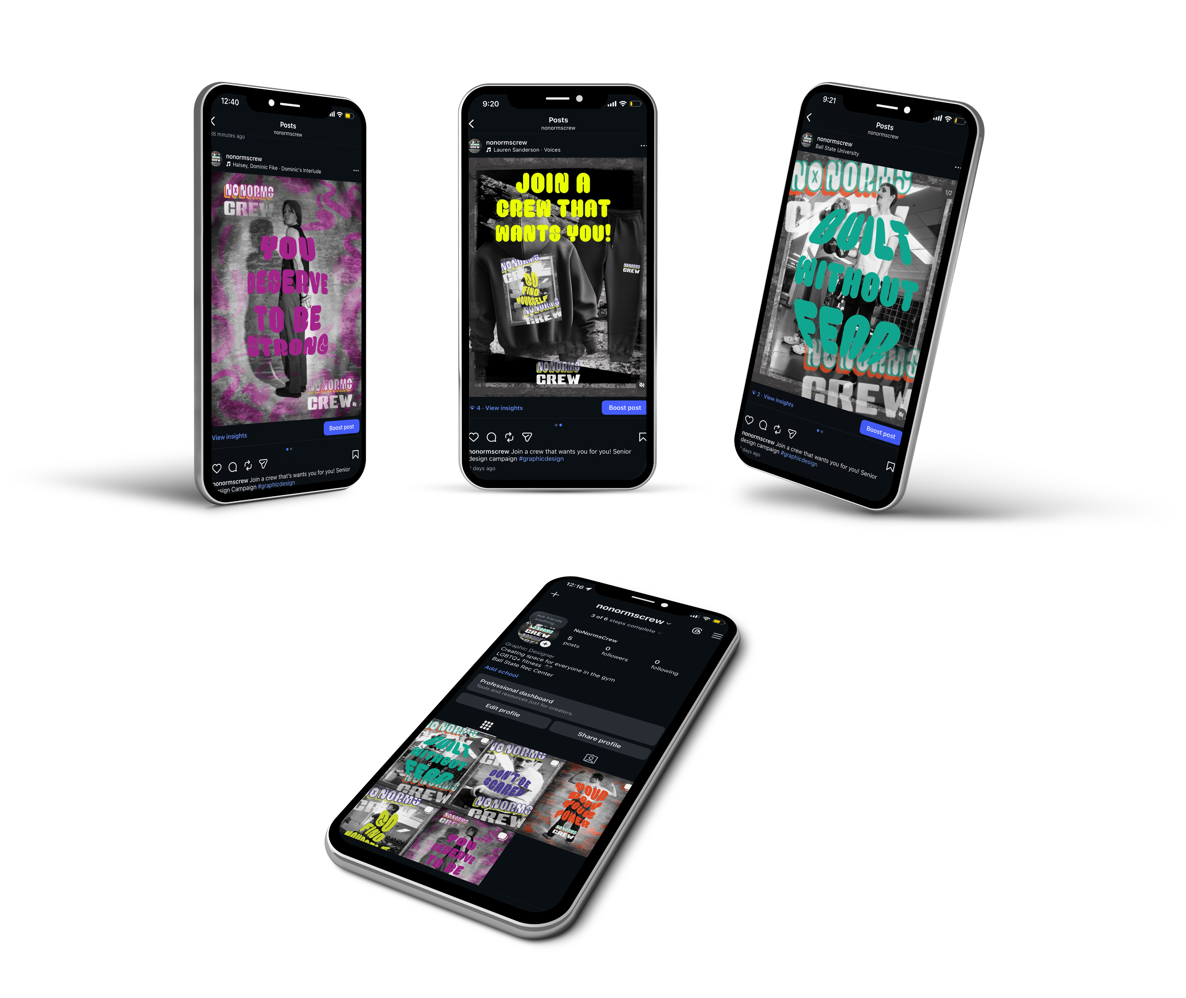
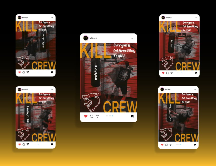
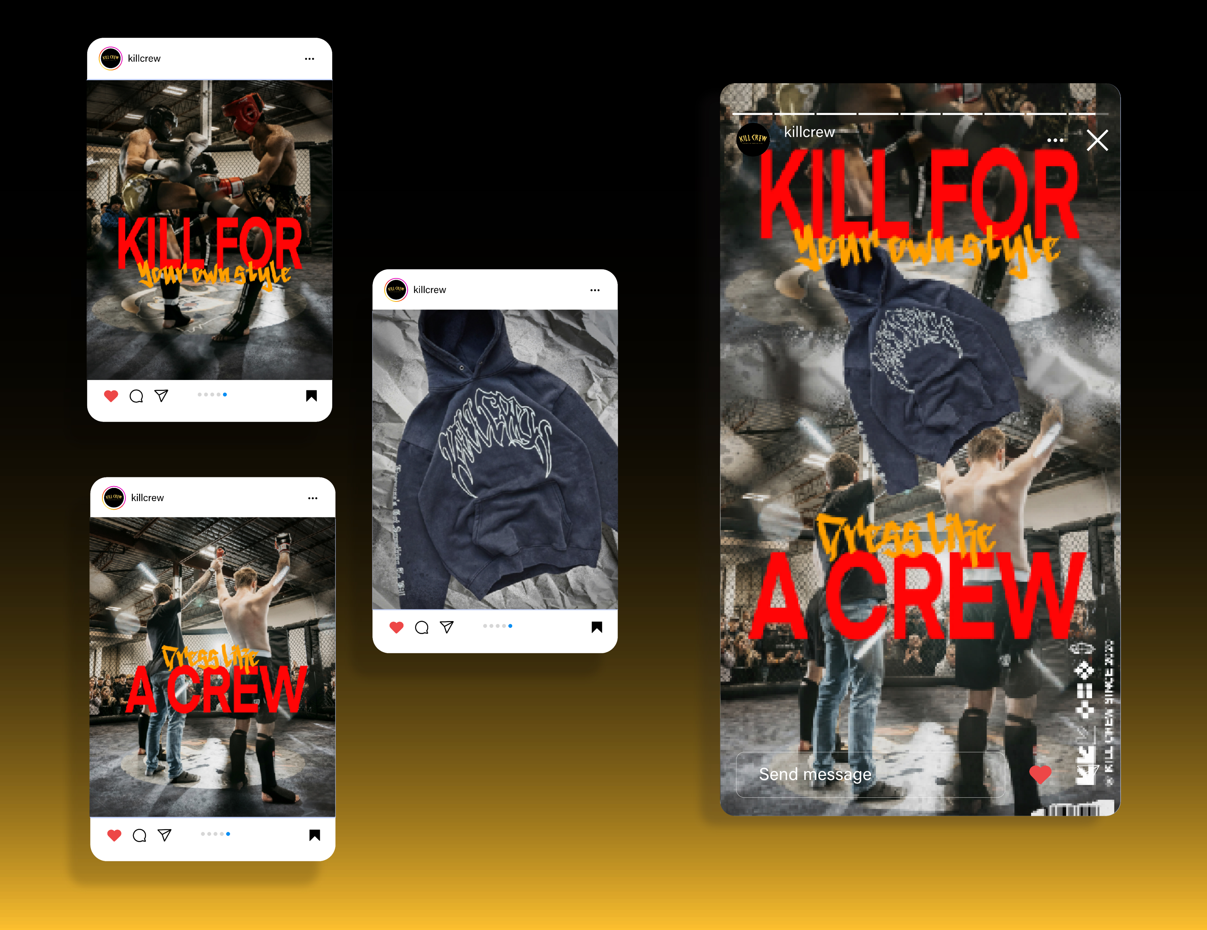
My concept was to create 3 different styles of posts, including 3 Instagram posts, 2 stories, 1 reel, and physical marketing designs such as billboards and a flyer.
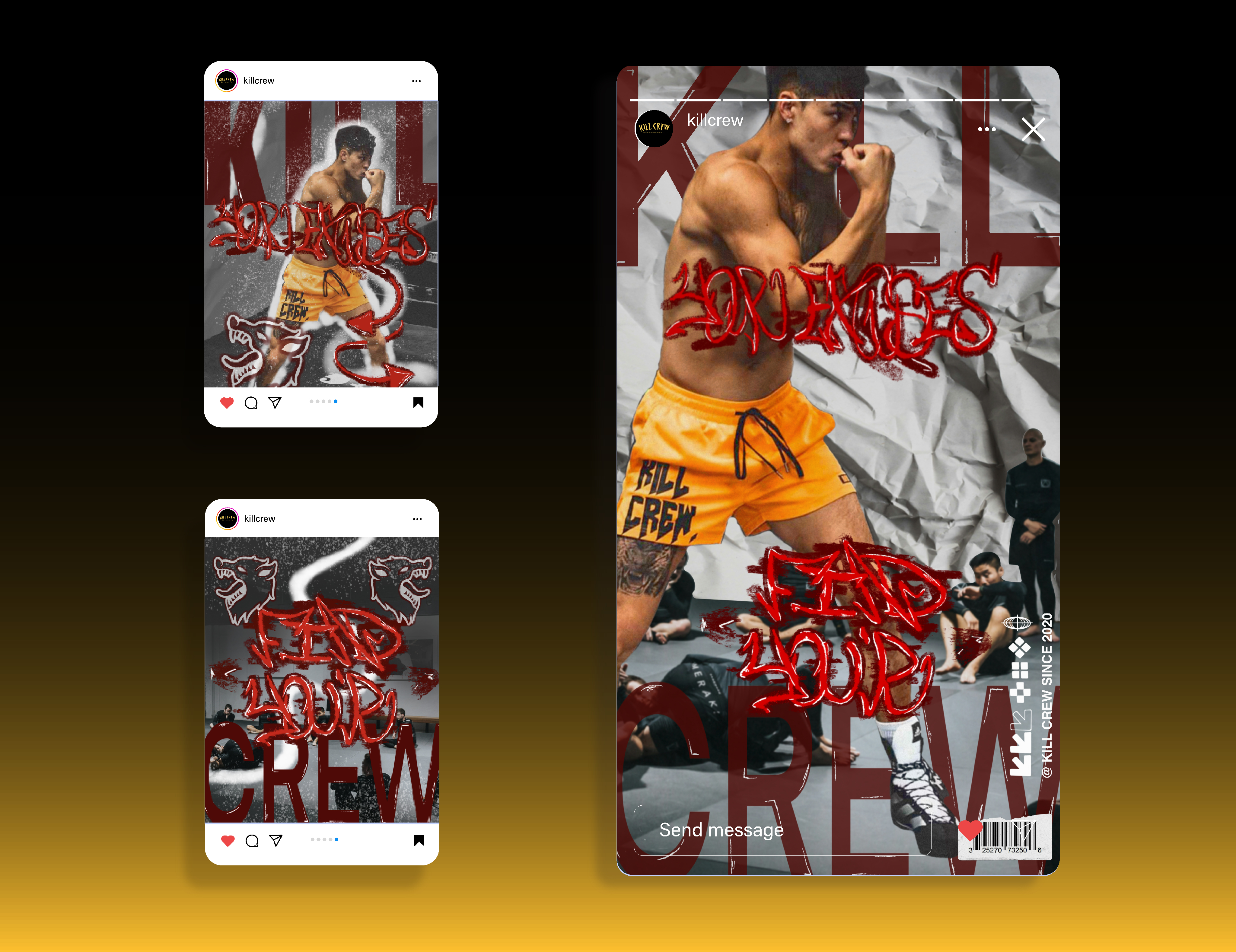
For my Instagram content, I incorporated one post featuring original photography I took myself, while the remaining designs used a combination of sourced images from Kill Crew’s page and Unsplash. I developed the designs in Procreate and refined them in Photoshop and Illustrator.
Instagram Posts
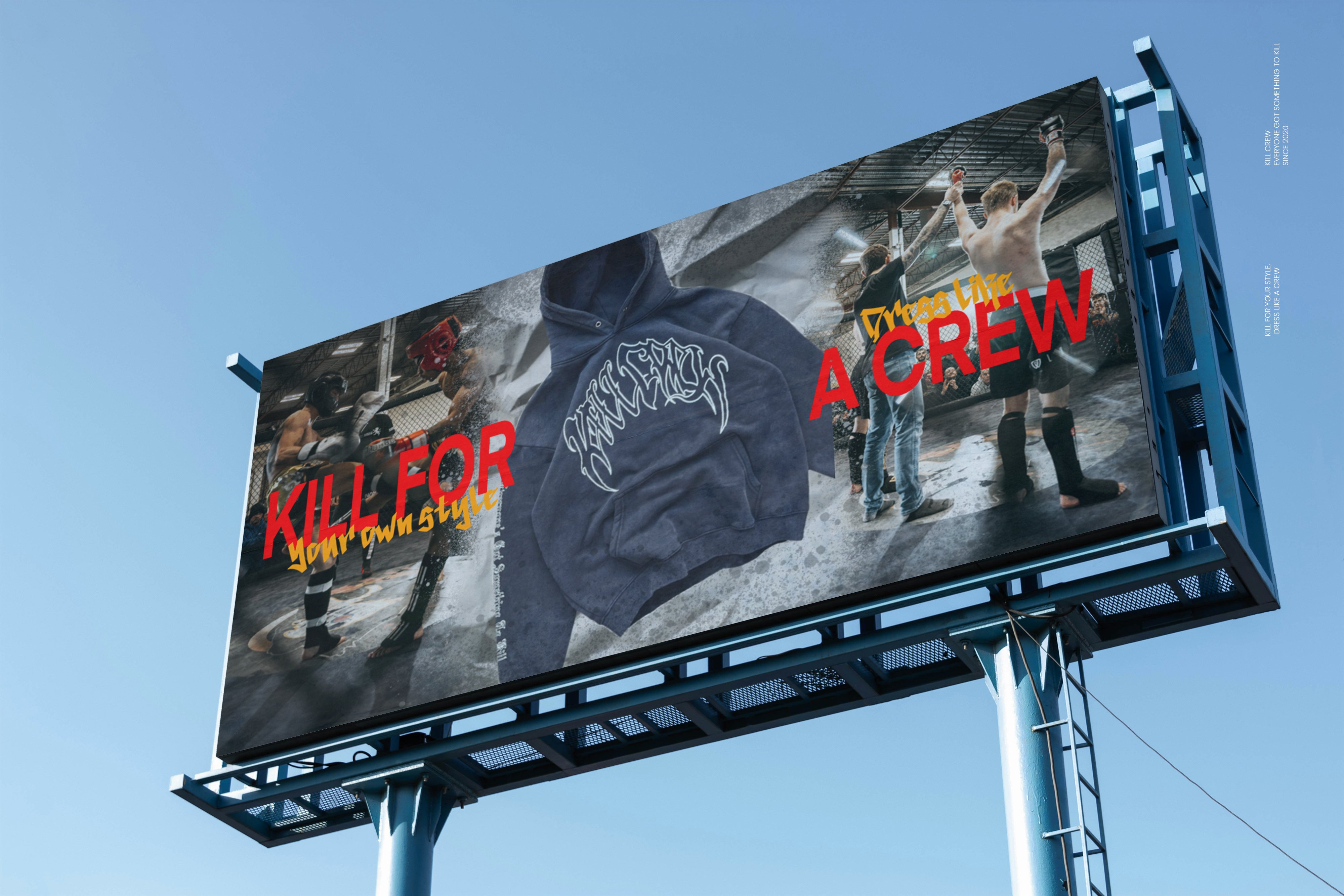
Billboards
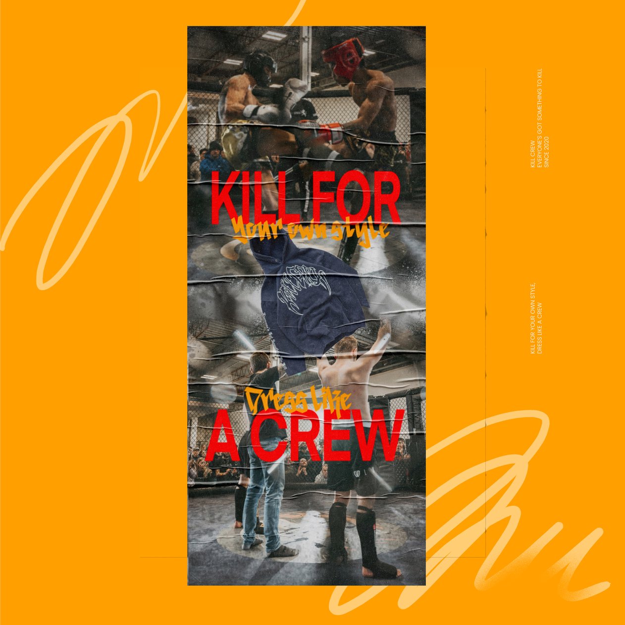
Throughout my designs, I wanted to create a fun, bold, and slightly edgy vibe by using playful slogans and puns. Phrases like “Kill Your Excuses, Find Your Crew,” “Kill for Your Style, Dress Like a Crew,” and “Break What Breaks You” were used to connect with the brand’s rebellious energy while still feeling motivational. I also incorporated Kill Crew’s existing slogan, “Everyone’s Got Something to Kill,” to keep the designs connected to the brand’s identity and message.
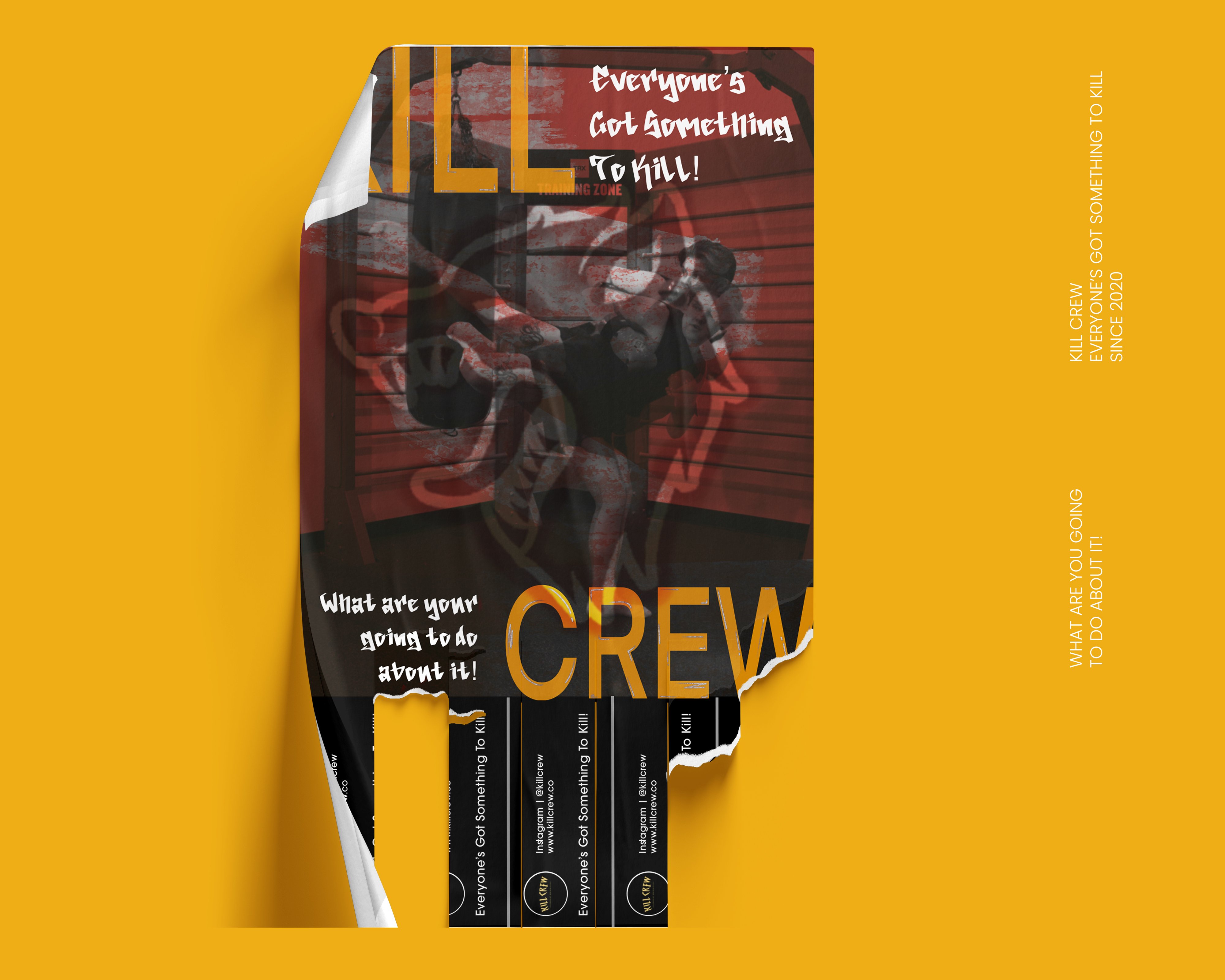
I also designed two billboards that people would see while driving to help expand the campaign beyond social media. The billboards were created to quickly grab attention on the street while keeping the same bold style and messaging used throughout the rest of the campaign.
I designed two posters to go alongside the Instagram posts so people could recognize the campaign both online and out in public. This helped create a stronger connection between the social media content and the physical marketing, making the brand more recognizable and memorable.
Finally, I designed a flyer with tear off tabs containing the brand’s information that would direct people to their Instagram page. This allowed people to easily take the information with them and connect with the brand online after seeing the physical advertisement.
Flyer
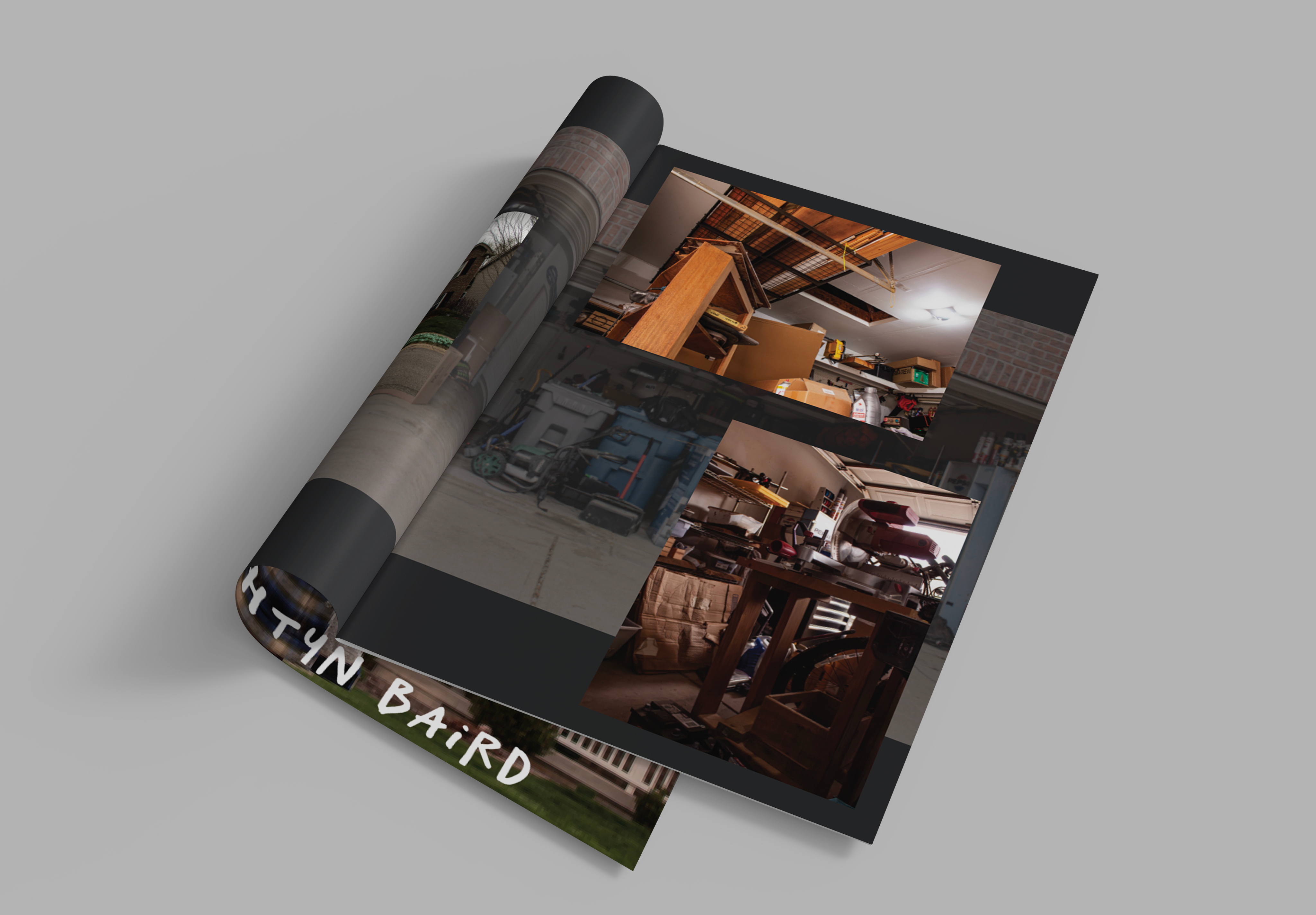
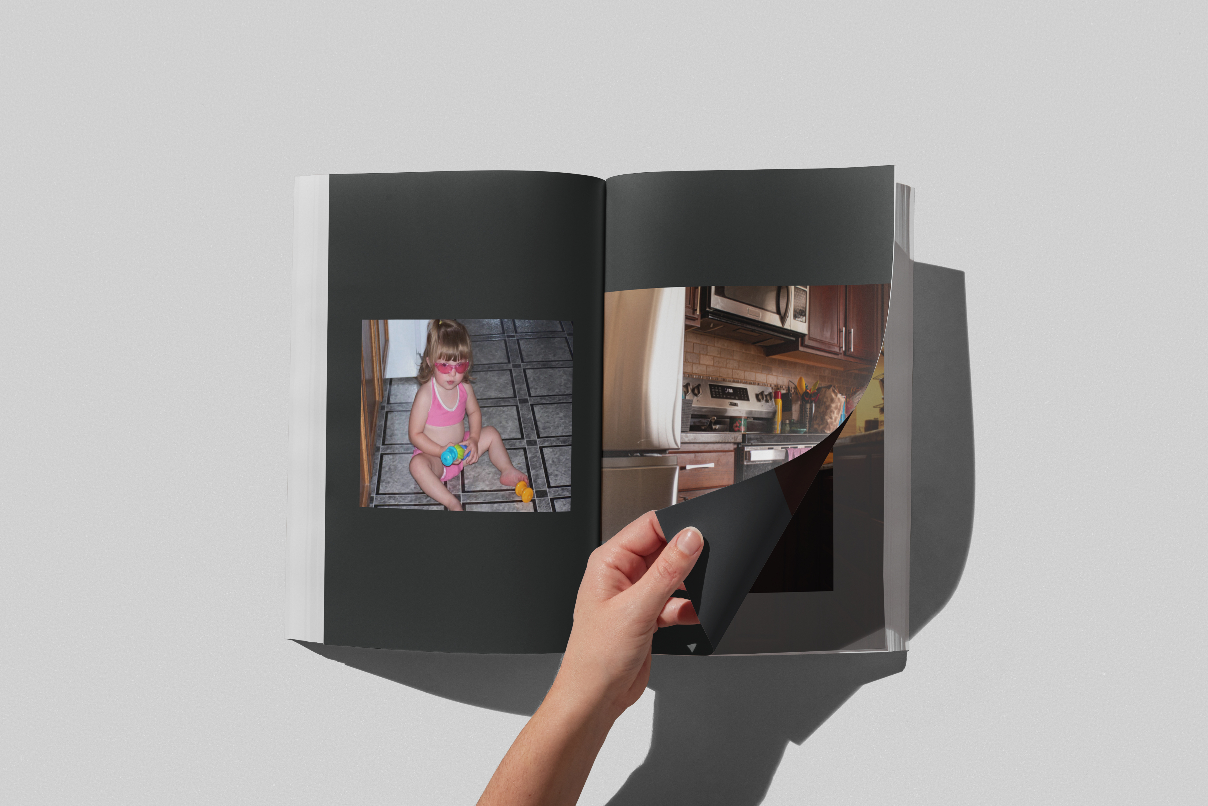
Photo Book
Photo Book
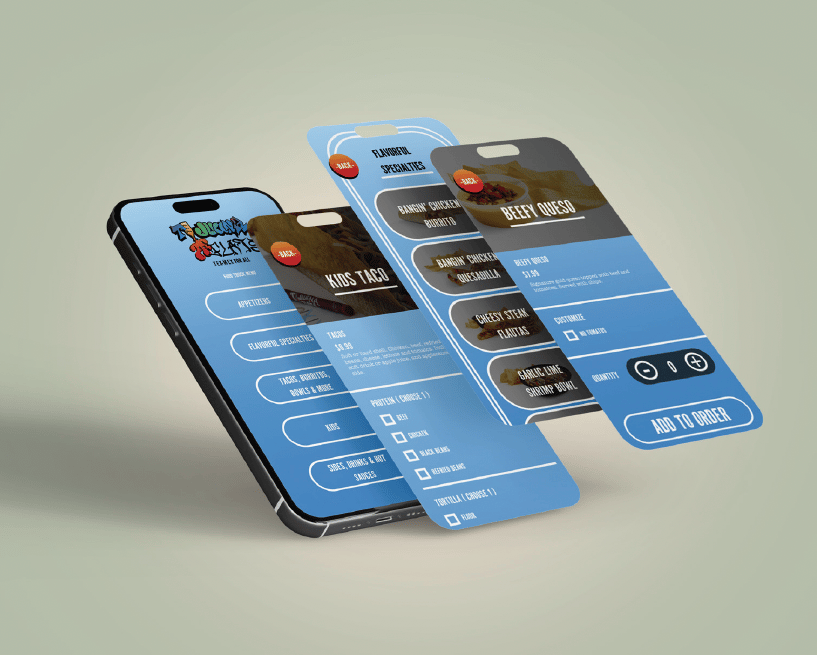
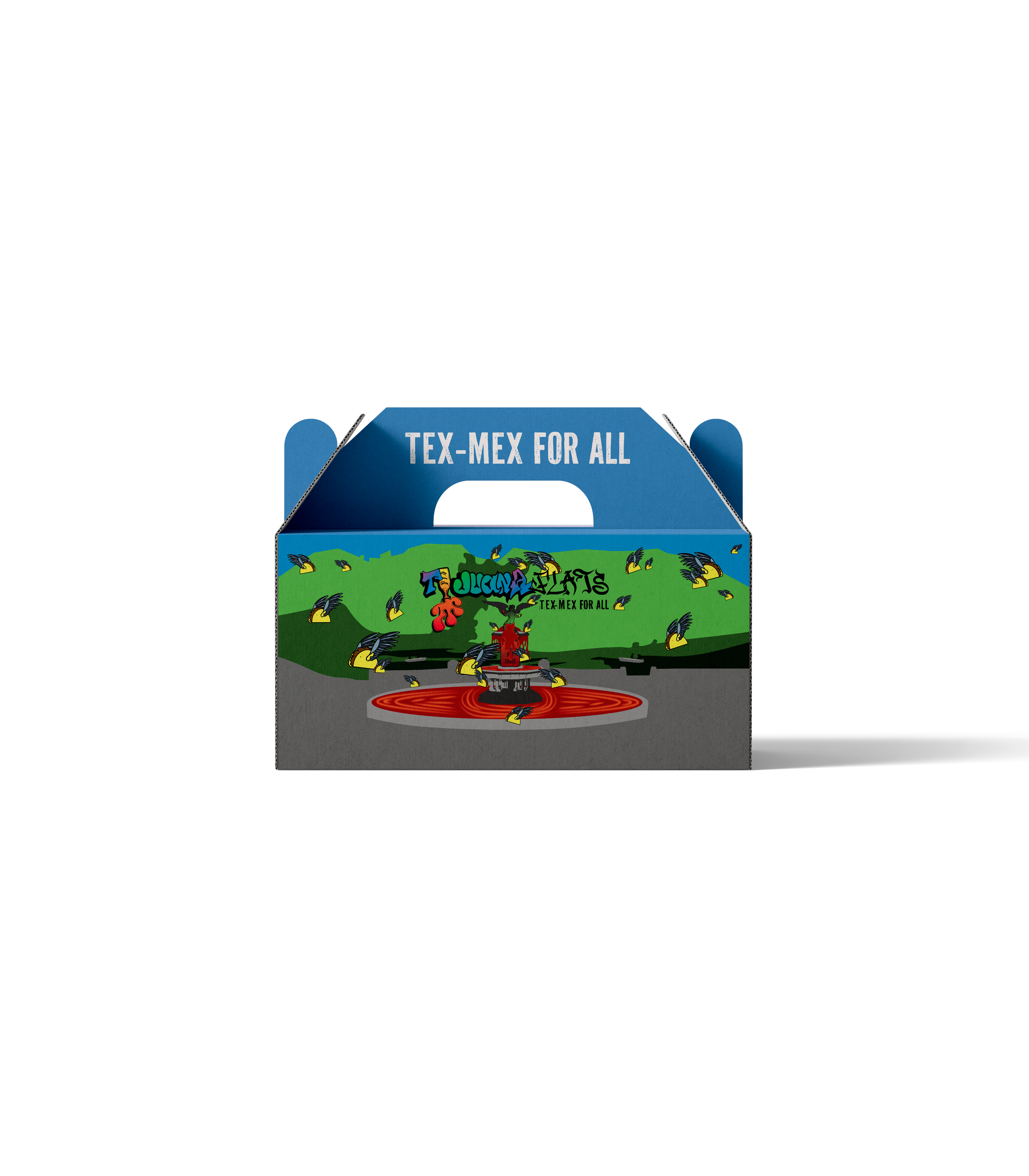
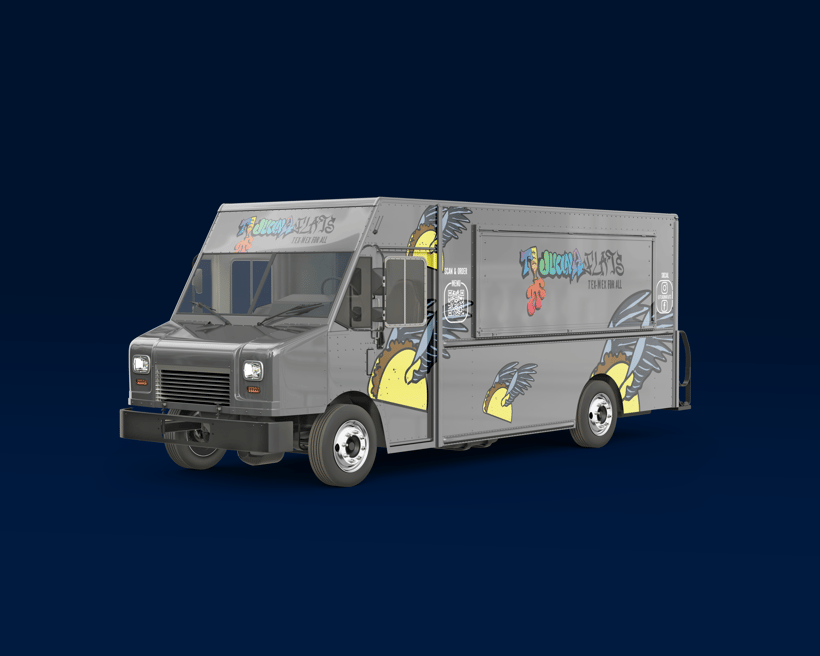
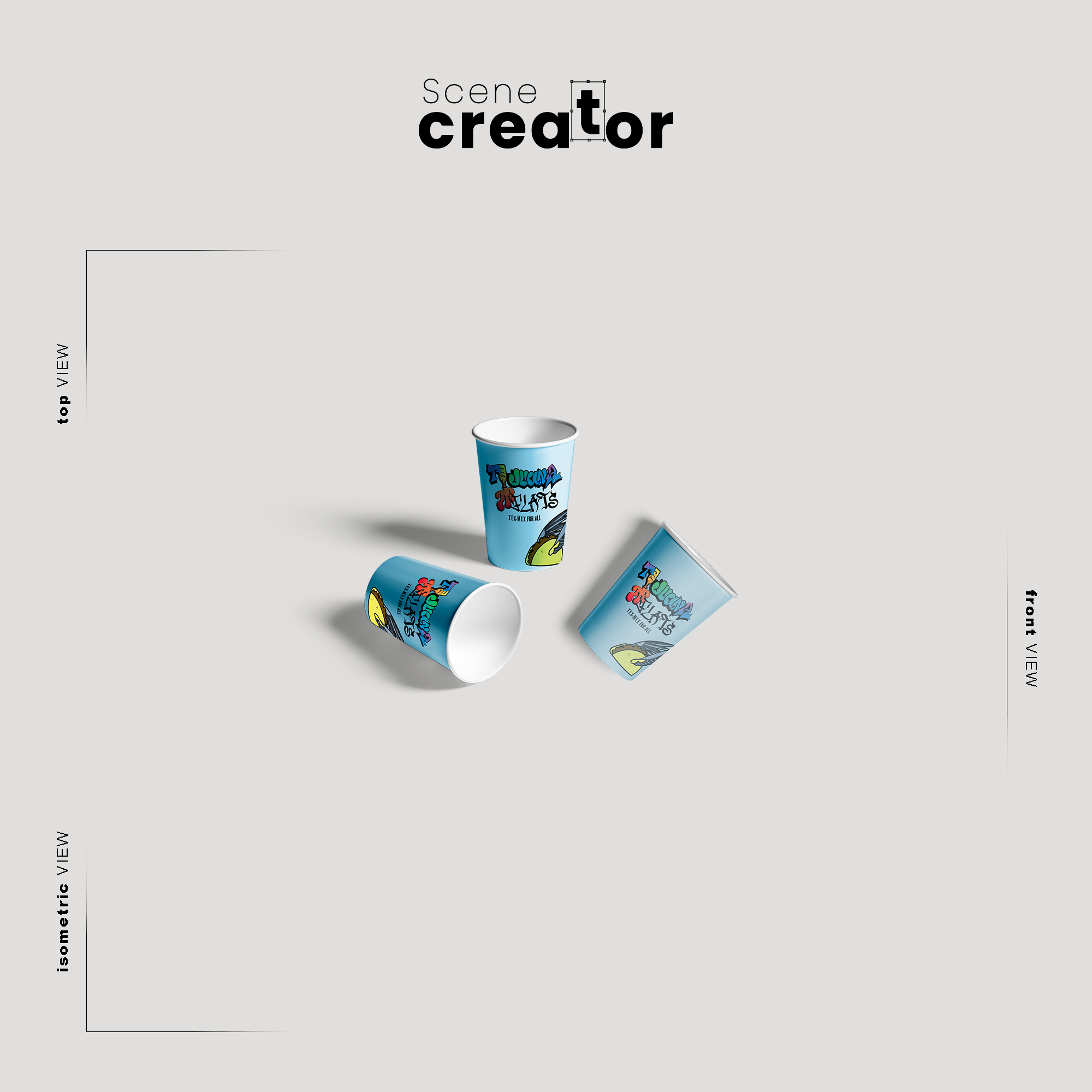
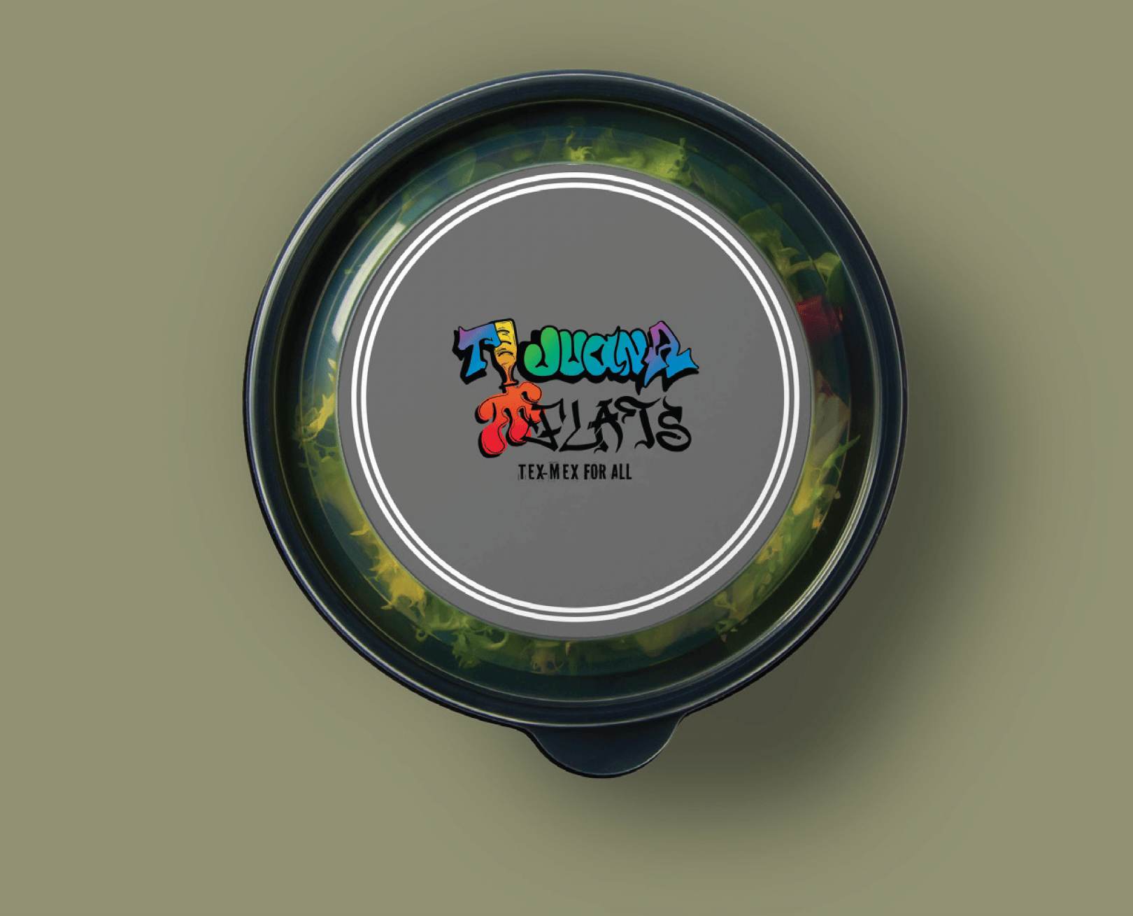
Food Truck
Food Truck
Kill Crew
Kill Crew
Genius Hour
For my designs, I used a mix of typography, including Helvetica Neue Medium and Easter Graffiti Demo, created in Procreate. I wanted to experiment with programs beyond Adobe to expand my design approach.
At the time of making this project i wanted to make there branding look more inclusive but i had no idea that there brand was homophobic.
My concept was to create 3 different styles of posts, including 3 Instagram posts, 2 stories, 1 reel, and physical marketing designs such as billboards and a flyer.
For my Instagram content, I incorporated one post featuring original photography I took myself, while the remaining designs used a combination of sourced images from Kill Crew’s page and Unsplash. I developed the designs in Procreate and refined them in Photoshop and Illustrator.
Instagram Posts
Billboards
Throughout my designs, I wanted to create a fun, bold, and slightly edgy vibe by using playful slogans and puns. Phrases like “Kill Your Excuses, Find Your Crew,” “Kill for Your Style, Dress Like a Crew,” and “Break What Breaks You” were used to connect with the brand’s rebellious energy while still feeling motivational. I also incorporated Kill Crew’s existing slogan, “Everyone’s Got Something to Kill,” to keep the designs connected to the brand’s identity and message.
I also designed two billboards that people would see while driving to help expand the campaign beyond social media. The billboards were created to quickly grab attention on the street while keeping the same bold style and messaging used throughout the rest of the campaign.
I designed two posters to go alongside the Instagram posts so people could recognize the campaign both online and out in public. This helped create a stronger connection between the social media content and the physical marketing, making the brand more recognizable and memorable.
Finally, I designed a flyer with tear off tabs containing the brand’s information that would direct people to their Instagram page. This allowed people to easily take the information with them and connect with the brand online after seeing the physical advertisement.
Flyer
Photo Book
Photo Book
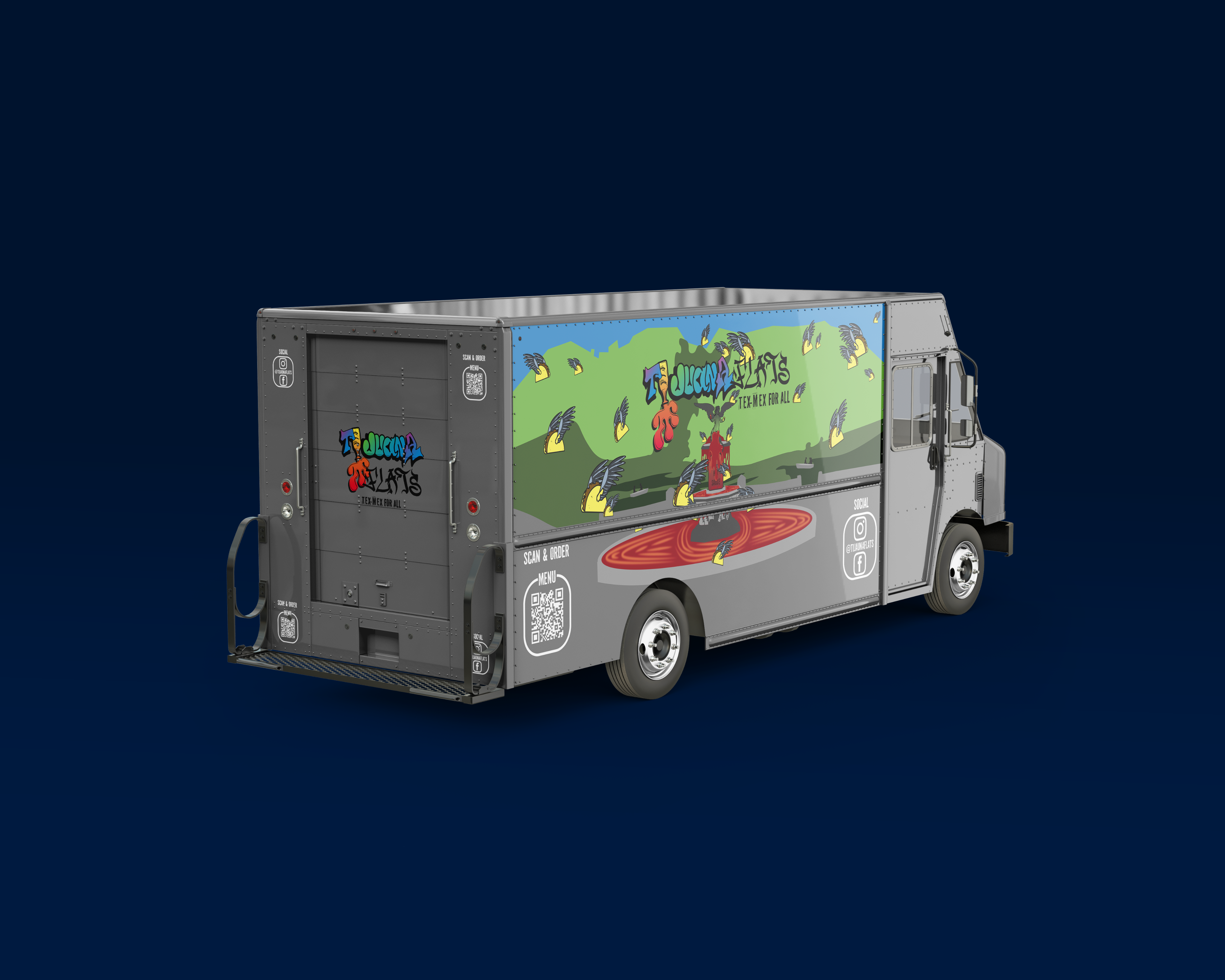
Food Truck
Food Truck
I also used Salbabida Sans Pro 0620 throughout my designs in my posters and instagram post. During my design process, I reflected on my Kill Crew
project. After learning that they support LGBTQ+ convention camps, I felt inspired to push my ideas further by developing my
own clothing brand one that advocates for inclusivity
and self-expression. I designed three color variations
of the logo to keep it flexible across different uses. I also created secondary versions with a graffiti spray gradient for a more expressive, urban feel, along with black & white options for a clean, minimal look. The overall color direction was inspired by brands that embrace simplicity through limited palettes, similar to colorless pride apparel and monochromatic streetwear. Students within the LGBTQ+ community at Ball State often can experience anxiety when attempting to begin their fitness journeys. Fitness spaces can feel intimidating due to perceived judgment, rigid gender norms, and a lack of visible inclusion. Through this design project, I aim to create work that reassures LGBTQ+ individuals that they belong in fitness spaces and do not need to feel afraid of the gym. Problem Statement Instagram Posts Posters Clothing Brand I created these logos using the typefaces Salbabida Sans Pro 0620 and Sneakers Pro Regular because they are both bold sans serif fonts that complement each other well.
I also used Salbabida Sans Pro 0620 throughout my designs in my posters and instagram post. During my design process, I reflected on my Kill Crew
project. After learning that they support LGBTQ+ convention camps, I felt inspired to push my ideas further by developing my
own clothing brand one that advocates for inclusivity
and self-expression. I designed three color variations
of the logo to keep it flexible across different uses. I also created secondary versions with a graffiti spray gradient for a more expressive, urban feel, along with black & white options for a clean, minimal look. The overall color direction was inspired by brands that embrace simplicity through limited palettes, similar to colorless pride apparel and monochromatic streetwear. Students within the LGBTQ+ community at Ball State often can experience anxiety when attempting to begin their fitness journeys. Fitness spaces can feel intimidating due to perceived judgment, rigid gender norms, and a lack of visible inclusion. Through this design project, I aim to create work that reassures LGBTQ+ individuals that they belong in fitness spaces and do not need to feel afraid of the gym. Extra Merchandise